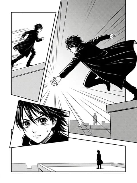
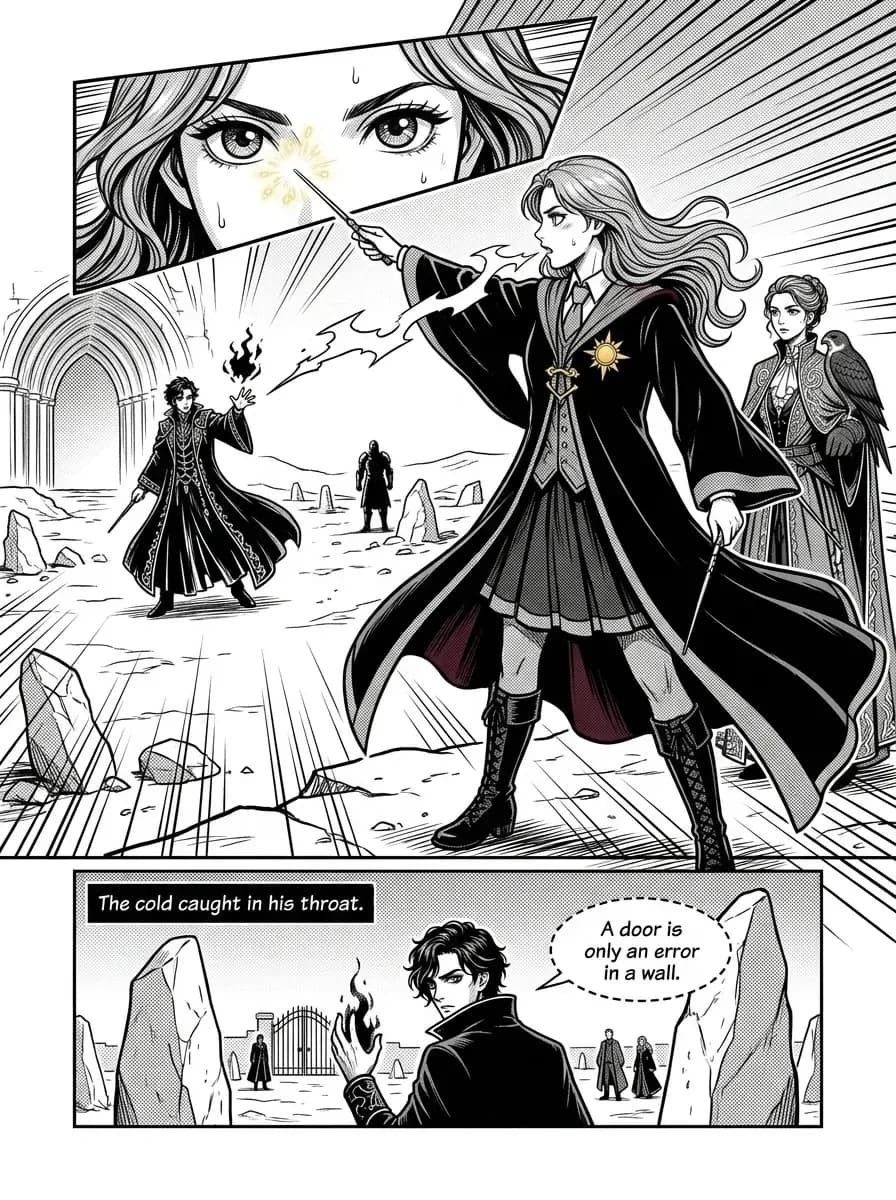
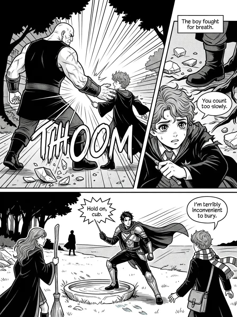
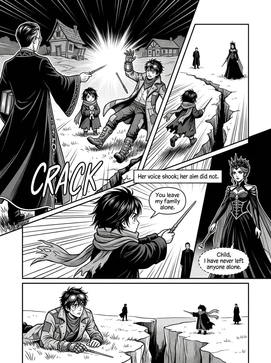
Ask an image model for "manga" and you get a colour anime screenshot, or a greyscale render with an airbrushed glow around every hand. Neither is a manga page. A manga page is printed in one black ink on white paper, and its grey is a material rather than a light: dot screentone, a flat field of dots cut to the shape it fills. Our Manga comic style draws your chess game on that page.
What the Manga style was built around
Almost no postwar manga is openly licensed, so the research ran on two pools that could not be merged. The first was 21 public-domain and CC0 candidates, from Hokusai's sketchbook plates to Kitazawa Rakuten's 1902 newspaper strip and wartime magazine cartoons. None came out first-class: thirteen survived as scoped witnesses to ancestry (the panel grid, the dot screen, the sweat drop) and eight were rejected, among them two CC0 "modern" panels that turned out to be fan pastiches.
The second pool was fifty interior pages of copyrighted manga, inspected one by one and recorded by address only, never stored. Twenty-six were kept first-class, sixteen with a scope, seven as subordinate witnesses, and one was rejected; eleven harvest descriptions were corrected because the picture did not show what the note said. The staging comes from the board-game pages: seven from Blitz, the one chess manga in the set, seven from March Comes in Like a Lion and four from Death Note. Since none of it may be published, the reference plate is a generated page a person accepted by eye. The generator's rules:
- Three materials, no ramp. Bare white paper, solid black, and flat dot screentone in two or three densities. No grey wash, no airbrushed glow, no smooth gradient on skin.
- Lines of force are typed. Speed lines trail what moves; focus lines converge on the point of contact around an empty white centre; a solid-black flash appears at most once per page, never on a quiet beat.
- The manga face on a realist body. Seven to eight heads tall, large glossy eyes with several catchlights under a heavy lash line, a tick of a nose, a pointed chin, hair in sharp clumped locks. No chibi bodies.
- The panel cut is part of the drama. Action beats get slanted borders, an overlapping inset, a figure breaking its frame and a bleed off the page; quiet beats get straight borders.
How a chess game reads in Manga
Board-game manga solved a problem chess comics share: nothing visibly moves. So a move becomes three panels: the piece approaches trailing speed lines, makes contact under converging focus lines, then settles in a held close-up. The evaluation is drawn on faces: a check is two adjacent eye-band strips, the attacker calm and the king's pupils shrunk under shadow lines. A capture reads by recoil, the struck figure leaving the frame, never by injury. When the position matters, the world's own terrain is seen from above, never a drawn chessboard.
Every page except a splash holds one quiet beat — a wide panel of small figures in open paper, or a still close-up — which gives the next impact its size. Sound effects are big hand-drawn Latin letters crossing panel borders; the page is told never to draw kana.
One exception to the ink: when your chess comic is planned, the planner (not you) picks one or two objects a leading character carries, such as a blade, a crown or a pair of bracers, and gives each one bright colour for the whole book. Every page is told to print only those in flat colour, and on the book's key pages the script is asked to keep the object in frame; colours that would vanish into ink are refused. It is an instruction to the artist, not a mask, so expect the occasional page where the colour lands small or slightly off.
The catch: on a crowded middlegame, with many pieces in play at once, black, white and tone separate the two sides less easily than colour does. For that game, Shōnen Colour is the better pick.
The bar a Manga page has to clear
- No colour apart from the spot-colour objects; a cream caption box counts as colour.
- Grey is visible dot screen with hard edges at 400% zoom, never a ramp, and never smooth grey across a face.
- Typed effect lines, at most one flash per page, none on a quiet page.
- The masked-border test. Cover every border, balloon and sound effect; the picture must still read as manga from the screentone, the line and the face.
The screen and face checks have no numeric thresholds yet; they wait on calibration against real renders. All of this is a checklist we read by eye when we calibrate and audit the style, not a filter running inside the renderer. What does run on every page is the lettering pass: it flags text the script did not ask for, such as an invented caption or a run of made-up Japanese characters, and empty balloons, and re-renders the page, though if no attempt comes back clean the least-flawed one ships. These checks are the last step of the four-step method behind every Chess2Story comic style.
The result is your game as a page from a paperback volume: a silence, an eye, and then the struck piece.